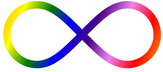
 Infinity has been giving me some trouble lately - not the concept, but the symbol. You see, when I write it, it comes out all wonky-looking. You'd think it's just a sideways 8, so what's the trouble?
Actually, there are two ways that I write the number 8 - I either start at the top, go counter-clockwise, and make (not coincidentally) a figure 8, or I draw the two ovals separately. It kind of just depends on my mood.
The infinity symbol doesn't look good either way, when I write it, but I recently realized that part of the problem is that, when I write it in the "figure 8" way, I start off going clockwise, which is opposite to how I write an 8. So I started writing it counter-clockwise instead. Now my infinities look great!
...and my 8's look like crap.


3 comments:
I naturally do both 8's and infinity symbols by going counter-clockwise. (I checked my stats notes as well for additional confirmation.)
The stacked o (or snowman) method of making an 8 seems really strange to me. I think it just feels very inefficient with no upside (I think it looks uglier, too, for instance).
I think my mom writes her 8's snowman-style (I like that term) and I do find it looks kind of nicer. I don't know. There are several numbers (2, 4, 8) and letters (w, y, z) that I write differently at different times.
I suspect lower-case d's are my most variable letter.
Post a Comment