Last week, my boss's boss asked for a chart showing rentals due in Arkansas this year. He said he also wanted a map that would show each month's rentals in a different color. I thought this would create an irritating, confusing map in which patterns would not readily jump out and to read which you'd have to keep glancing back and forth to the legend.
So I decided to try it as small multiples, creating a calendar style map. I also created the map he had asked for, in case he really liked it better. I was hoping the small multiples would be seen as better, but it's hard to separate real needs from "stuff I'm proud of because it's cool and some guy wrote a book about it."
Anyway, both of my immediate bosses liked the calendar version better. Hooray! They like how it really shows that September and October are the big months. Here are the two maps, so you can compare for yourself. I'll do my best to make sure these expand if you click on them.
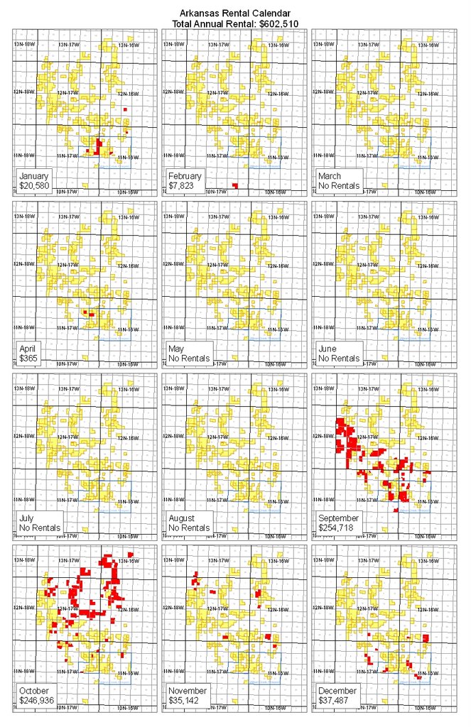
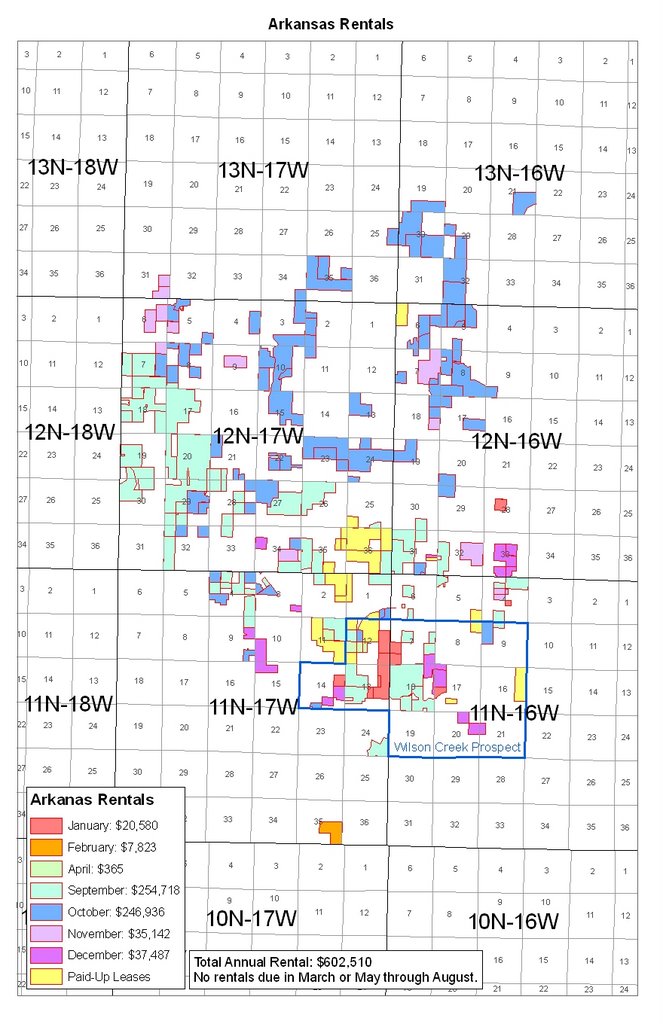
These definitely look better on a large sheet of paper (the original is 11x17, or like two regular sheets of paper side by side), but hopefully these pictures will do them some justice, at least. Obviously if you were really making maps for computer display, neither of these would do.


1 comment:
Nice job, Tam!
Post a Comment